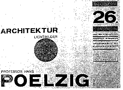
A presentation by Yue Liu on pages 51-89, Mullet and Sano
Introduction || Rules ||Principals || Common Errors || Techniques
I. Introduction
Scale, contrast and proportion are about the interrelationships among the parts and also on the parts themselves.
Definitions:
Scale describes the relative size or magnitude of a given design element in relation to other design elements and the composition as a whole. (Page 51) --The feeling of a design fitting its space and its surrounding
Contrast results from noticeable differences along a common visual dimension that can be observed between elements in a composition. (Page 52) --Visual distinctions
Proportion deals in ratios rather than fixed sizes. It determines the balance and harmony of the relation between elements. (Page 52) -- The rapport between two dimensions
Advantages:
- Differentiation. Contrast is essential for differentiating elements from one another.
- Emphasis. Scale and contrast can be used to emphasize important elements or areas in the composition.
- Activity. Scale and contrast move the viewer's eyes through the composition in predictable sequence that can be used to support a particular communication goal.
- Interest. Scale and contrast add visual interest to a composition by juxtaposing elements with strongly opposed visual qualities to create tension, drama, and excitement.
Back to top
II. Rules
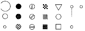
Retinal variables: size, value, hue (chromatic color), orientation, texture, shape, and position.
The fundamental units of visual communication
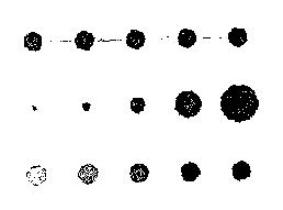
Four styles of perception:
- Associative: ignores variation on one visual dimension in reading the remainder of the display. All variables except size and value.
- Selective: isolate all instances of a given category and perceptually groups them into a single image. All variables except shape.
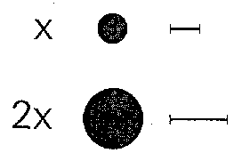
- Ordered: determine the relative ordering of values along a perceptual dimension. Position, size, and value are ordered in human perceptions.
- Quantitative: determine the amount of difference between two ordered values. Position and size are quantitative.
The length of visual variables:
Shape is the longest visual variable.
Orientation is the shortest dimension.
Back to top
III. Principles
Proportion sets the rhythm of the display; the scale of its components determines its forcefulness and their contrasts determine its excitability.
- Clarity. Clear enough to convey the intended distinctions.
- Harmony. Harmonious relation between the elements in the display.
- Activity. Strong contrasts to product an effective dynamic within the display.
- Restraint. Sufficiently restrained to permit the viewer to remain in control of the experience.
Clarity.
- Contrast is effective when clearly intentional.
- Clarity in the role of each element in the ensemble.
- Single-minded focus on communication.
Harmony.
- Pleasing interaction of the parts.
- Golden section. value = ( sqrt ( 5 ) - 1 ) / 2 = 0.618
Activity.
- Strong contrasts, but few in numbers.
- Limited to one or a few dimensions.
- Contrasts are conscious, few and never overwhelming.

-
Restraint.
- Limiting contrasts to those needed
- Enhancing the selective perception
- Extracting meaningful information from the display
Back to top
IV. Common Errors
Common errors involve the following two aspects:
- Contrasts that are too sharp or not sharp enough.
- Figures that relate poorly to their ground.
The common errors are:
- Insufficient contrast. Make the elements difficult to distinguish.
- Excessive contrast. Make chaos.
- Visual interference. Contrasts on one visual dimension often disrupt the processing of visual information on other dimensions.
- Spatial tension. Controls are placed too closely to one another.
- Overextension. Windows are too large for the information they contain.
- Awkward dimension. Windows relate poorly to the screen or window context within which they appear.
Back to top
V. Techniques
- Establishing perceptual layers.
- Squint test. Using one eye to identify the features of interest and reduce the light and disrupt the focus.
- Using scale and contrast to divide the display into a few distinct regions or layers.
- Effective perceptual layering helps the viewer to selectively read information in one group with a minimum of interference from the others.
- Sharpening visual distinctions.
- Sharpening is a technique that ensures that contrast between elements is adequate for effective discrimination or aesthetic effect.
- Sharpening to create meaningful distinctions.
- Sharpening is clearly intentional and fulfills a specific communication goal.
- Integrating figure and ground.
- Figure and ground be approximately equal in terms of their scale and visual weight.
- Figure and ground exist in a state of balance and stability.
- Figure and ground act to reinforce one another.
- To maximize visual integration, internal element should have an adequate margin area.
Back to top